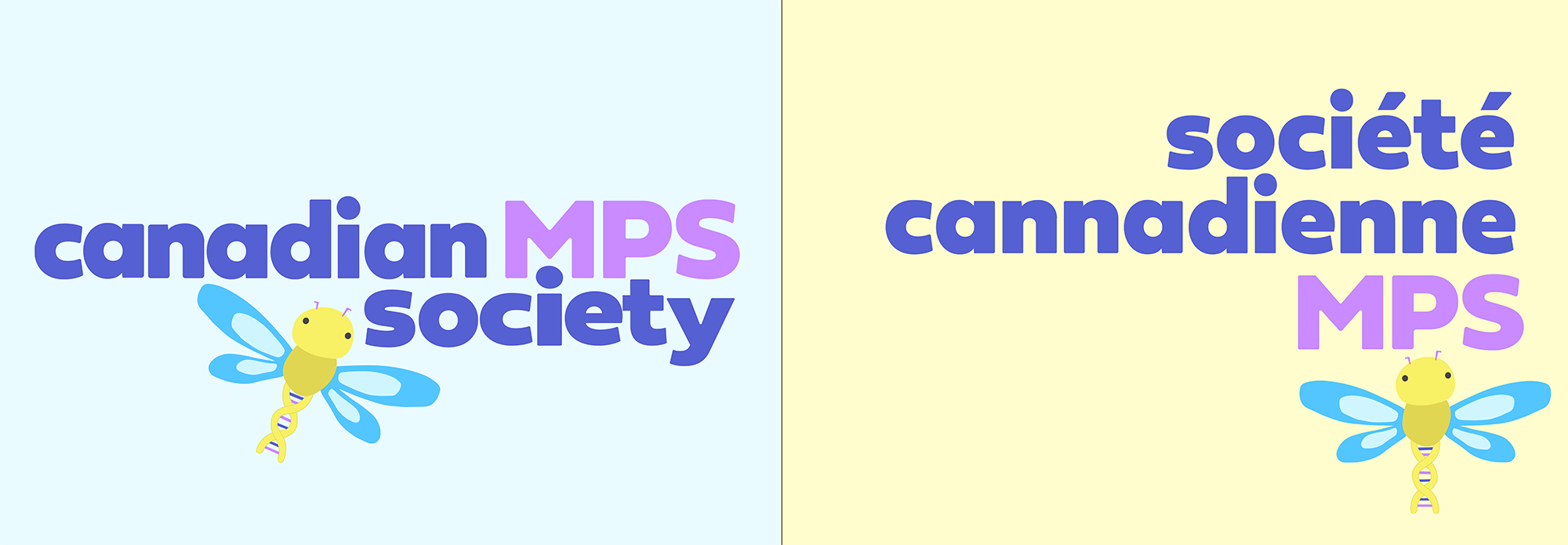
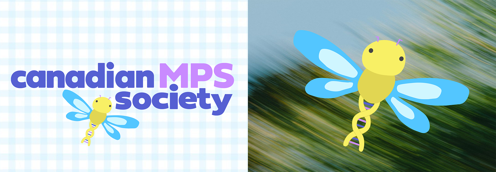
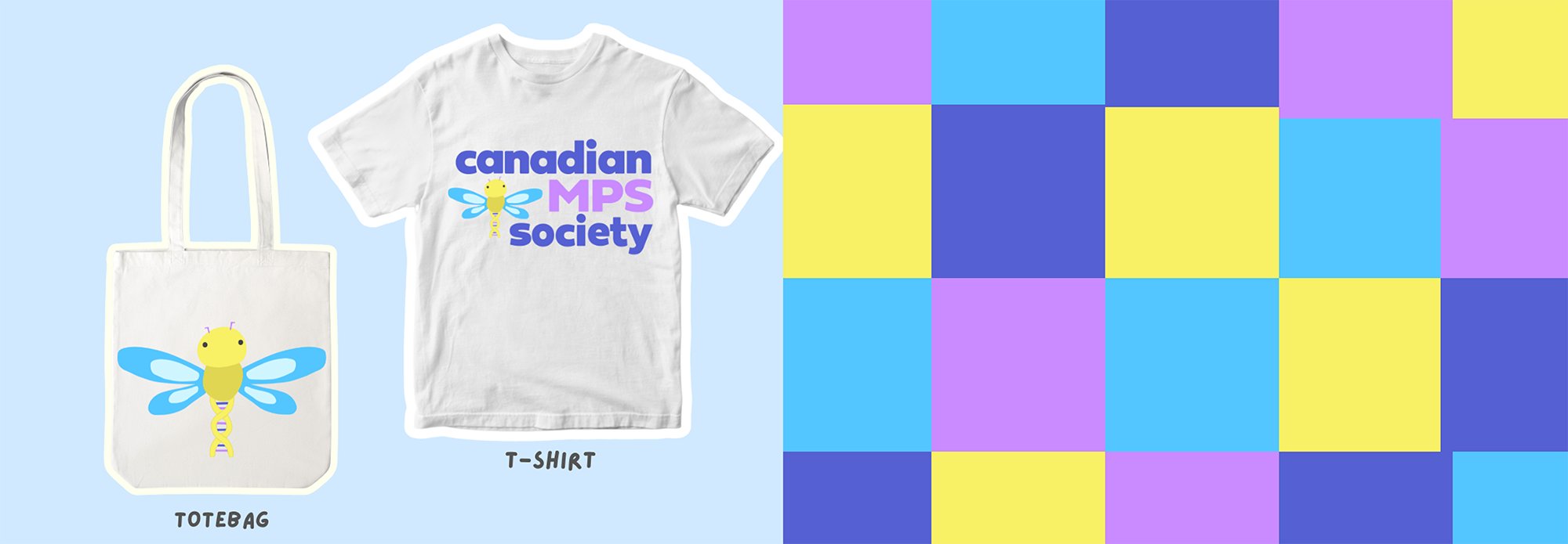
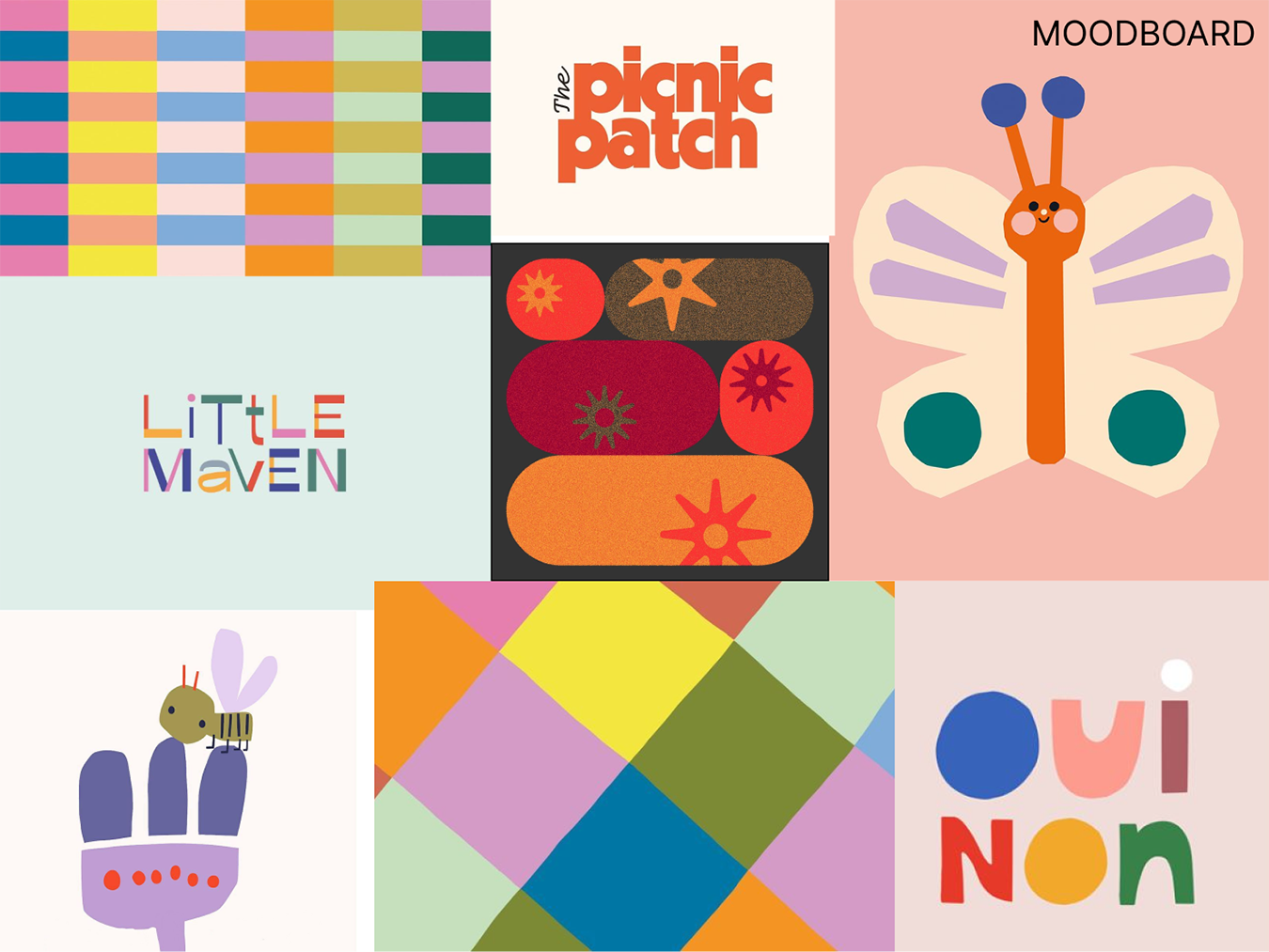
The Solution: A refreshed brand identity was developed to shift the tone from sterile to playful and human. This featured rounded, bubbly typography, a vibrant colour palette, and a new emblem of a dragonfly - a universal symbol of hope. The dragonfly was illustrated with the intentional looseness and imperfection of a child’s drawing, reflecting the spirit of the community it represents.


